Wednesday, April 21, 2010
Footer Design : Tutorials Techniques & Examples
Do you like this story?
How to Build a Footer That Doesn�t Stink
As the first thing visitors see, home pages and headers often steal the design spotlight.But above-the-fold thinking neglects the natural flow of vertical page layout. What happens when people reach the end of a page?You can bet that a simple copyright statement won�t hold visitors� attention, but many pages are designed with the expectation that people will find their way� or so we assume.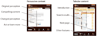
10 Techniques For a Fantastic Footer
A strong footer can leave your visitors with a lasting positive impression.There are tons of creative ways to boost the cool factor of your footers by focusing on both form and function. Below you�ll find 10 simple ideas to inspire you towards footer greatness.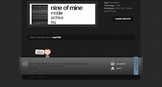
MAKING YOUR FOOTER STAY PUT WITH CSS
One problem I run into pretty frequently when coding a site in to XHTML and CSS is making my footer dock to the bottom of the screen. It�s especially annoying if you have a page that�s short on content and the footer, which happens to be a different color that the body background doesn�t stay at the bottom of the browser window. I can hear you say, �But why don�t you just do a fixed position on it. That�s easy enough.� True, but if you do that then it�s always at the bottom of the screen no matter how tall the window is. So if I have a page with a lot of content that footer shouldn�t show up until the content is done. How do we fix this? Let me show you. Here�s what the problem looks like: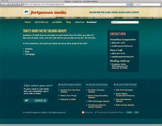
Footers In Modern Web Design: Creative Examples and Ideas
According to classic principles of web design, everything at the bottom of the page isn�t that important. Most users think like that. And most designers are convinced that this is true. Site elements at the bottom of the page aren�t really able to catch visitors� attention which is why footers are often forgotten or ignored and not given the attention they deserve.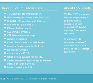
Fat Footers: The Long Tail of Your Website
Not so long ago most footers were not more than a single line with a simple copyright notice and a link to the site designer. That time has passed and the footer has evolved. The current trend is creating a big, fat footer for your website. These large footers are generally stocked full with content: about, connect, subscribe, links to other articles, sitemap, back to the top link, categories list, recent comments, etc.
Trends and Examples in Recent Web Design: Big, Informative and Creative Footers
The bottom of the page, the ending for your web design job, the final section. This is footer. The part of the site that, in a classic interpretation, is only for copyright and some links.We are in the �Internet Era� and a site is no longer a quick presentation for farsighted companies or strange nerds and geeks. Nowadays a web site must work; it should be interactive, it should communicate ideas, it should present in a unique way products and service, it should involve the users. In modern web design, fortunately, designers and user experience developers are saying �NO� to boring and standard footers.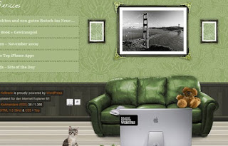
How to Create a Simple & Sleek Web 2.0 Site Footer
Adobe Design Premium CS5 software offers you complete creative freedom without sacrificing precision or quality, whether working in print, web, interactive, or mobile media.Since Web 2.0 hit the internet, footers have become more important than ever, and there has been some great looking work done downstairs. In this tutorial I�ll show you how to produce a sleek looking site footer in Photoshop.
Designing a Creative Blog Footer
Let's start by creating a new document. For this I'll be using a size of 1400 x 600 pixels, but if you're not using a large monitor you may want to use something a bit smaller. The size of our footer is going to be around 800 x 110 pixels though, so you should just use something larger than that.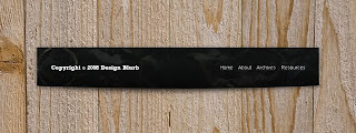
Photoshop Tutorial Intermediate Web Site Design - Footer
The footer plays an important role in our web site as it is where we ask users to sign up for the newsletter, find us on the various social networks and find our office. It plays the final piece of our puzzle.
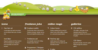
500 Wonderful Website Footer Designs For Inspirations

This post was written by: Franklin Manuel
Franklin Manuel is a professional blogger, web designer and front end web developer. Follow him on Twitter
Subscribe to:
Post Comments (Atom)

0 Responses to “Footer Design : Tutorials Techniques & Examples”
Post a Comment