Tuesday, June 1, 2010
Design News #5 : Web Designs
Do you like this story?
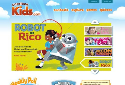
30 Vibrant and Colorful Website Designs
Deciding on a color scheme can often be one of the most difficult parts of the web design process. There are a lot of different approaches that you can take with a color scheme, and in this post we�ll be showcasing 30 sites that feature vibrant color schemes.
60 Excellent Examples of Illustration in Web Design
The great thing about web design is that we have an enormous range of styles, techniques and ideas to implement when designing. You can go from Super Clean and Minimal Layouts to Colorful Layouts, and you can use Huge Typography or Hand Drawn elements � as long as you keep your style and give your website your own personality. As illustration is somewhere in between those options and is something that can be used to give your website a very unique touch, we decided to gather 60 excellent examples of illustration in web design. There should be plenty here to inspire you.
20 Amazing Examples of Nature Illustrations in Footer Design
Footer is important element in a web page but often underestimated from designers. It is placed at the bottom of the page and, from the beginning, it is used to contain little navigation and informational data as copyright, licenses, developer�s name, etc.Footer can be used also to contain more additional information that can could be very useful for the user. For example, in a blog the footer can be used in order to list most viewed or last posts, last comments, blog-roll, etc.This post showcases 20 creative footers created using amazing nature illustrations.
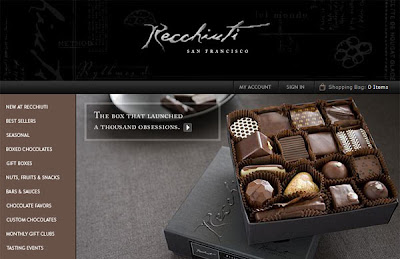
30+ sites of cakes, chocolats and desserts for a sweet web design
Since on Your Inspiration Web applies the theory that if one thing is very useful to us authors can probably also be good for our readers, let me share with you the �soft� considerations and give you some �inspiration.Soon I will start working on the layout in a coffee shop and as it is an area where I have not had the opportunity to try, it seemed right to try a little information network. Graphical resource, trends, images, ideas.
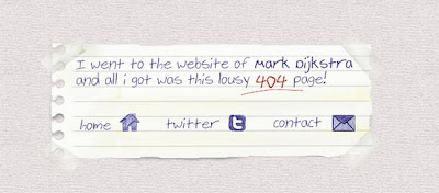
Beautiful and Useful 404 Error Pages for Inspiration
Errors don�t need to be ugly. On the Web, any links that are broken result in a 404 Not Found error message. There are two ways you can address this issue when your user navigates towards a broken link.Option 1: Present the user with an old and boring default error page, which displays no information other than "There�s an error."Option 2: The second solution is to present them with a custom error page design that can suggest alternative things they can see or do in order to resolve their problem.Which one do you think is better? Obviously, the second option.
49 Fascinating E-Commerce Websites for your Inspiration
E-commerce has always been part of the vast world of Internet. E-commerce emerged as a new way to shop. It made it so that people could shop online and buy items without going to the store. Online shopping has rapidly gained popularity and the revenues by shopping online has increased drastically over the decade.As the online community gets bigger and evolves, e-commerce websites also need to evolve their design and make it comply with the current design trends. It has been essential for e-commerce websites to be clean, beautiful and simple.

This post was written by: Franklin Manuel
Franklin Manuel is a professional blogger, web designer and front end web developer. Follow him on Twitter
Subscribe to:
Post Comments (Atom)


0 Responses to “Design News #5 : Web Designs”
Post a Comment